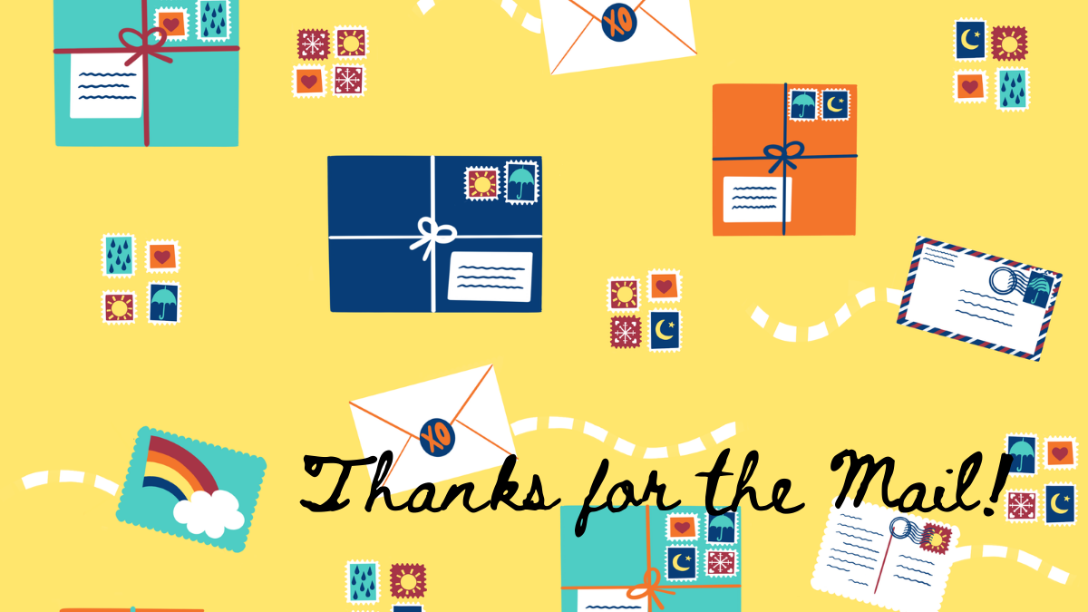
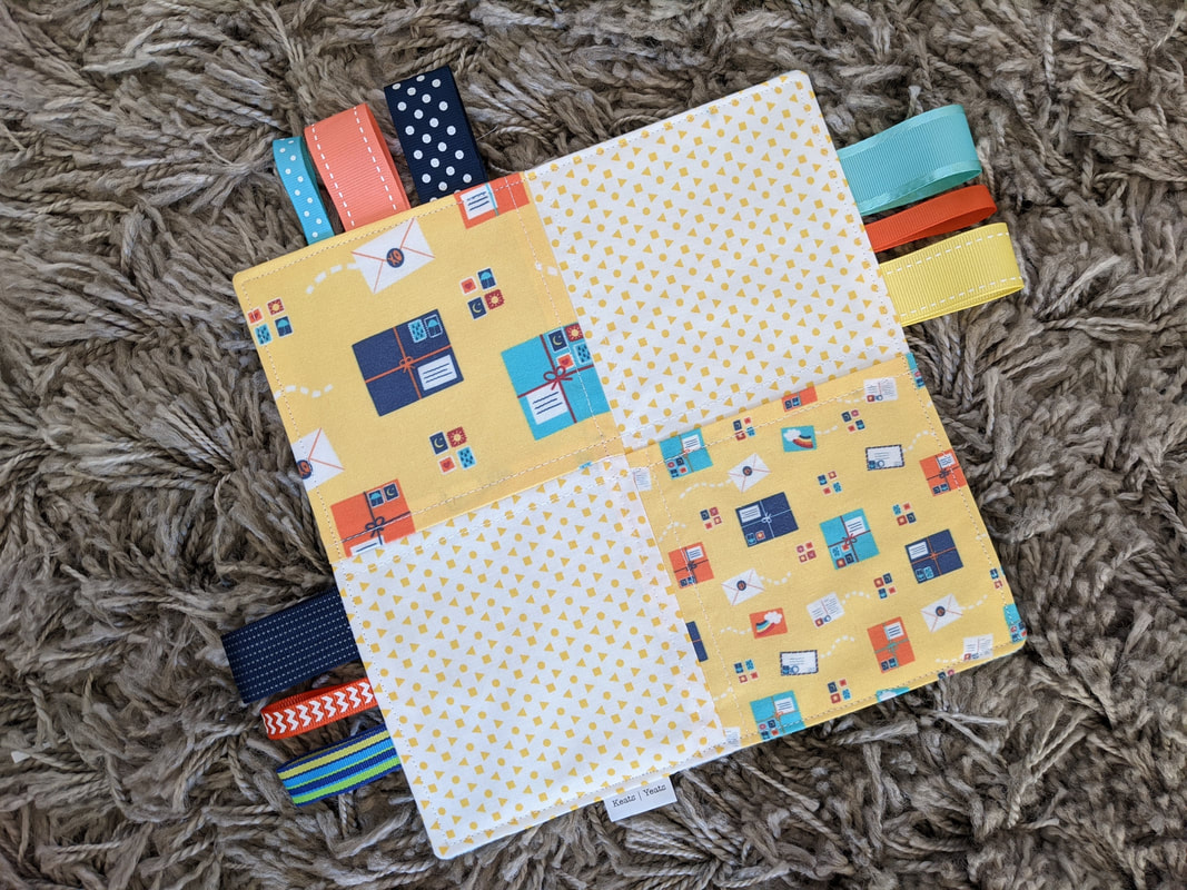
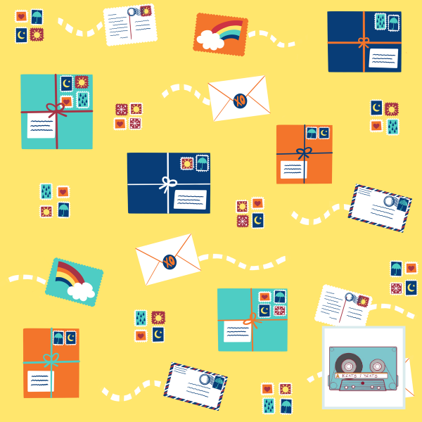
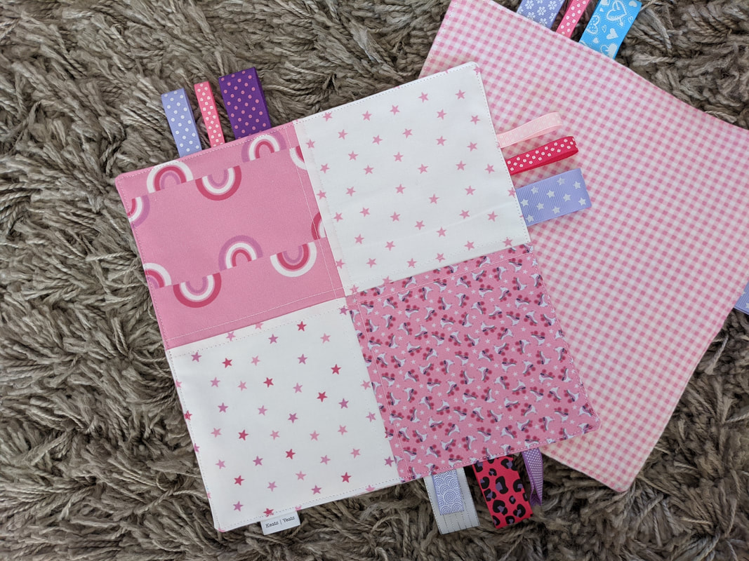
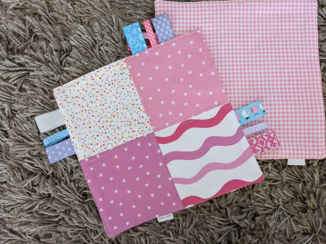
 Another entry for a Spoonflower Design Challenge. The theme this time was around was geared toward thanking essential workers. Ah! Covid is now inserting itself in my fabric designs. I'm trying to incorporate more orange in my drawings, so that was part of my color selection choices. I also chose a weather motif for the stamps as homage to the whole mail carrier being delivering despite rain, sleet, snow, etc. I'd like to take the stamps and postmark elements and run with it for a larger collection. Also, I love mail so much. So you know. I came in 284th place, by the way. Out of 503! Woot! I don't stand a chance in this competitive world. But it's all fun anyway. Sensory Squares (like that pictured above) is available in the Keats Yeats Etsy shop.
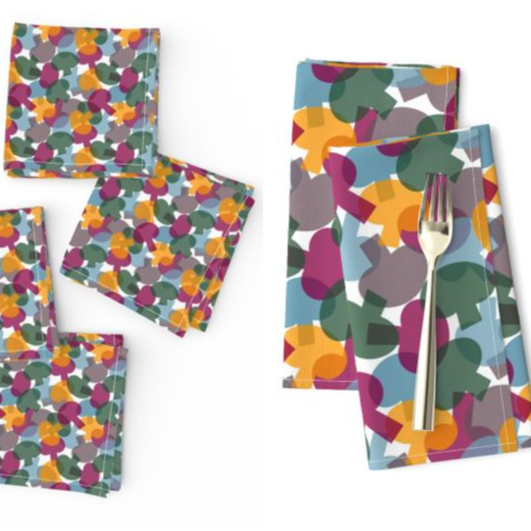
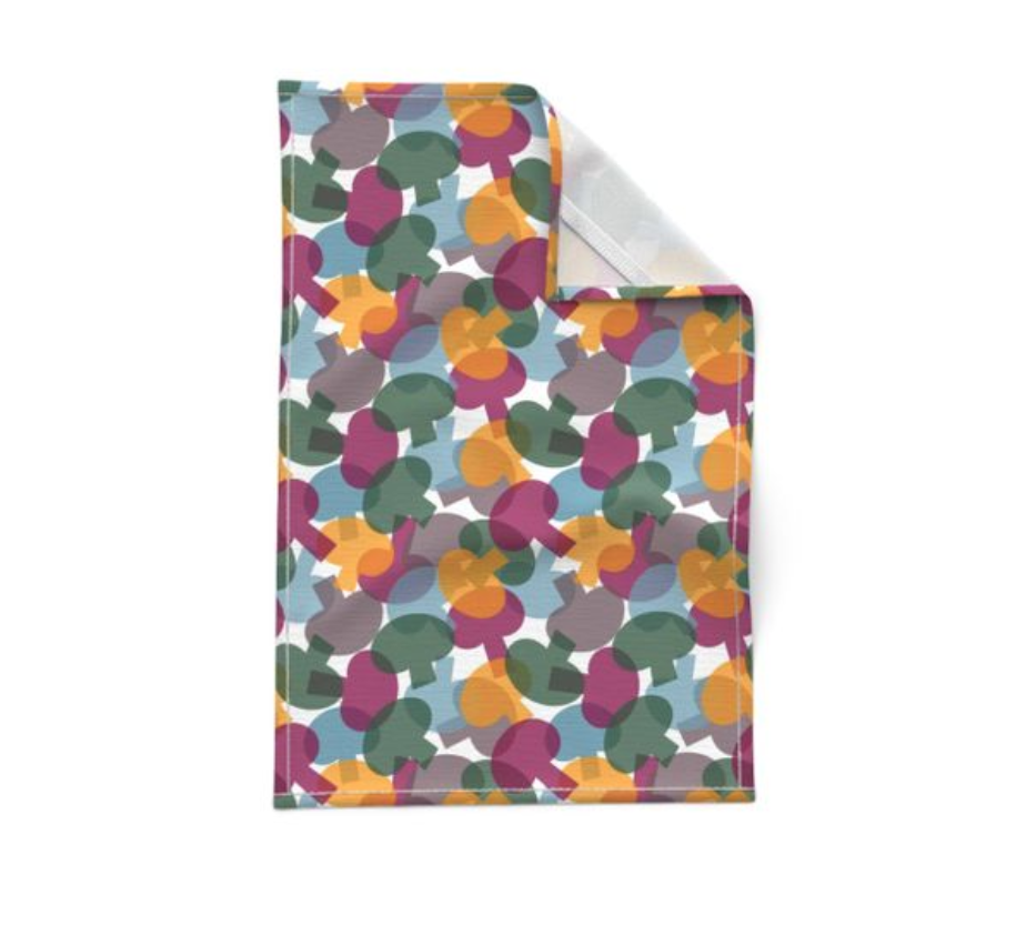
Fabric is available at Spoonflower. 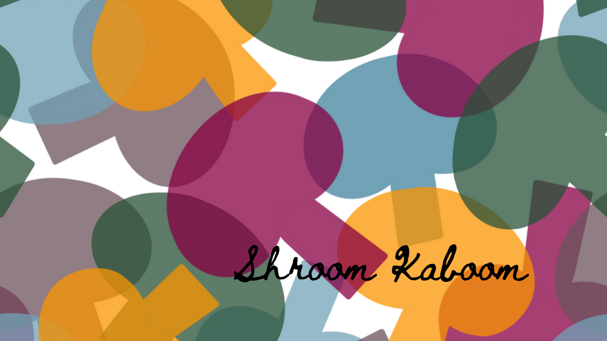 We have (yet another) Spoonflower Design Challenge to thank for Shroom Kaboom! I made it a personal goal to enter one challenge a week for the month of August and fungi was the theme for one of those weeks. I wanted to use more orange (I keep trying!) and kept to a minimal style. I think this fabric would make for great tea towels. I placed 590 out of 964. Wowee. You can shop this fabric (and more) at Spoonflower.
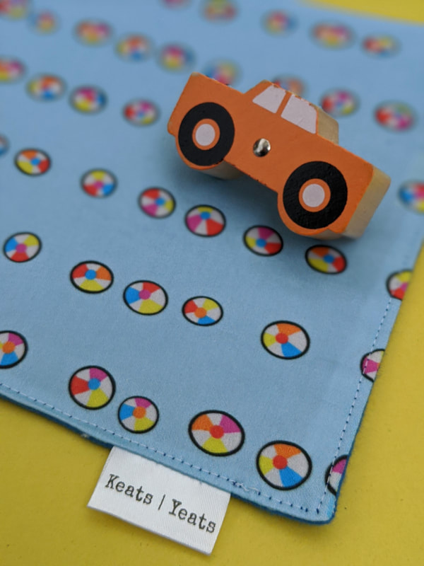
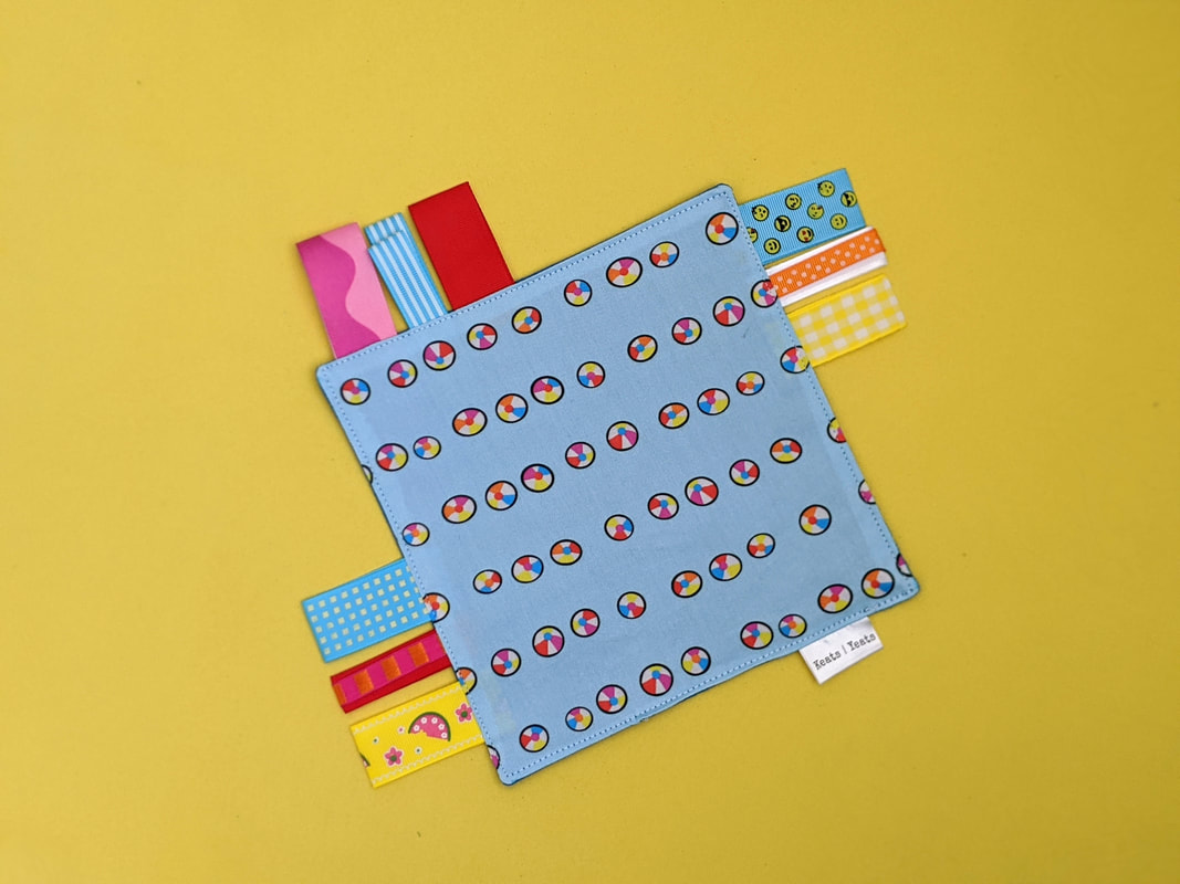
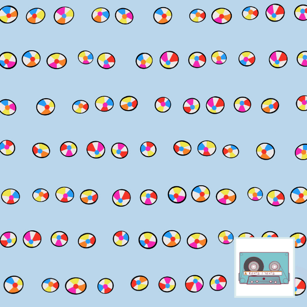
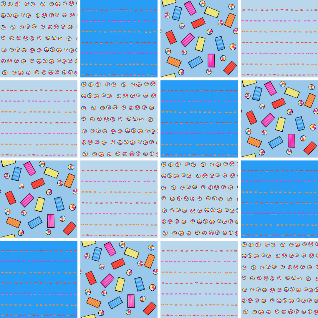
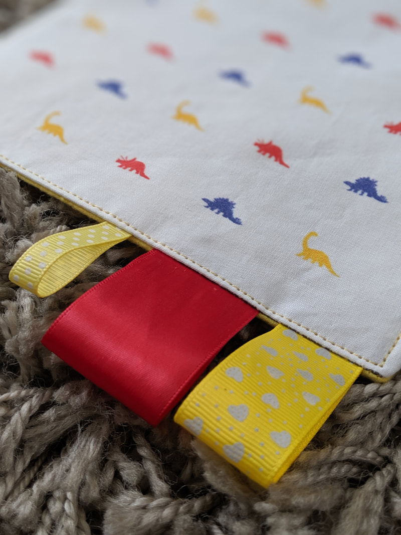
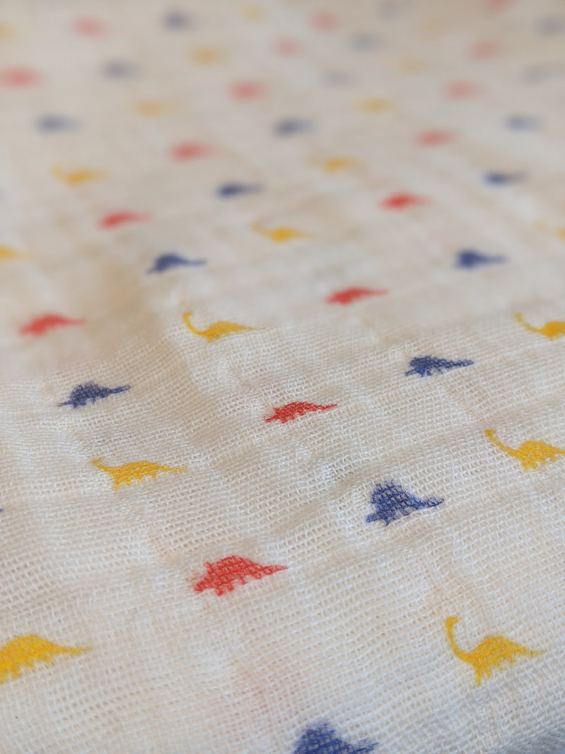
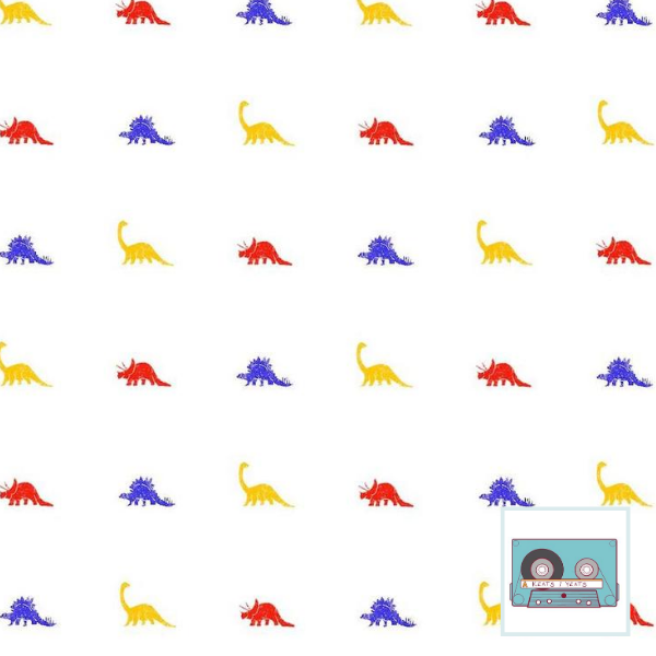
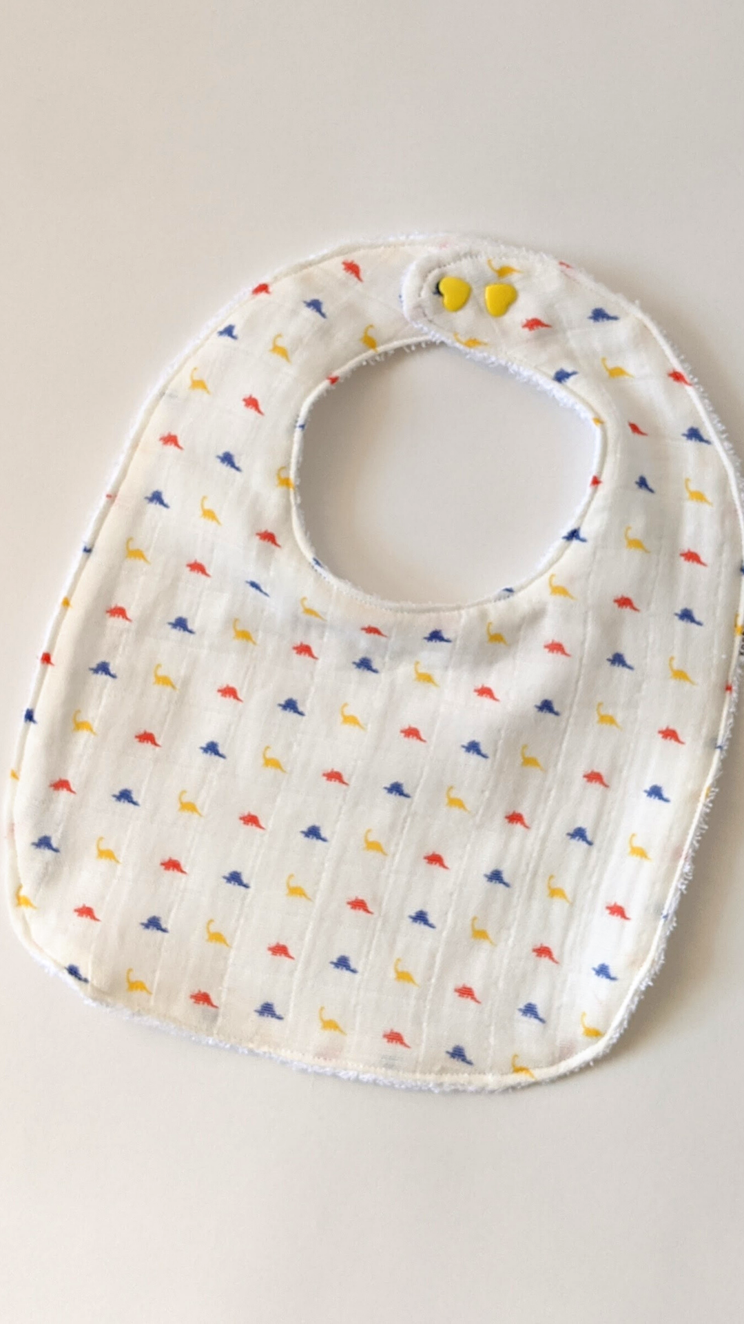
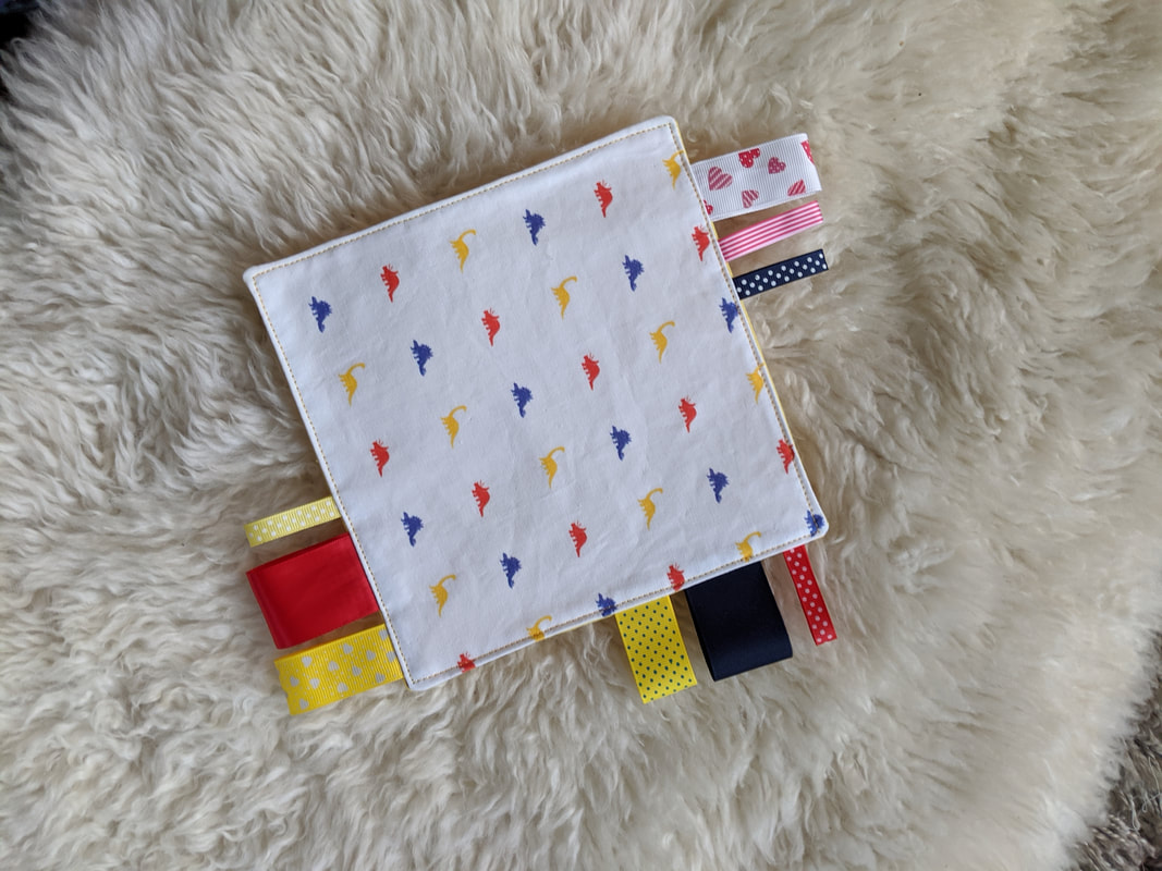
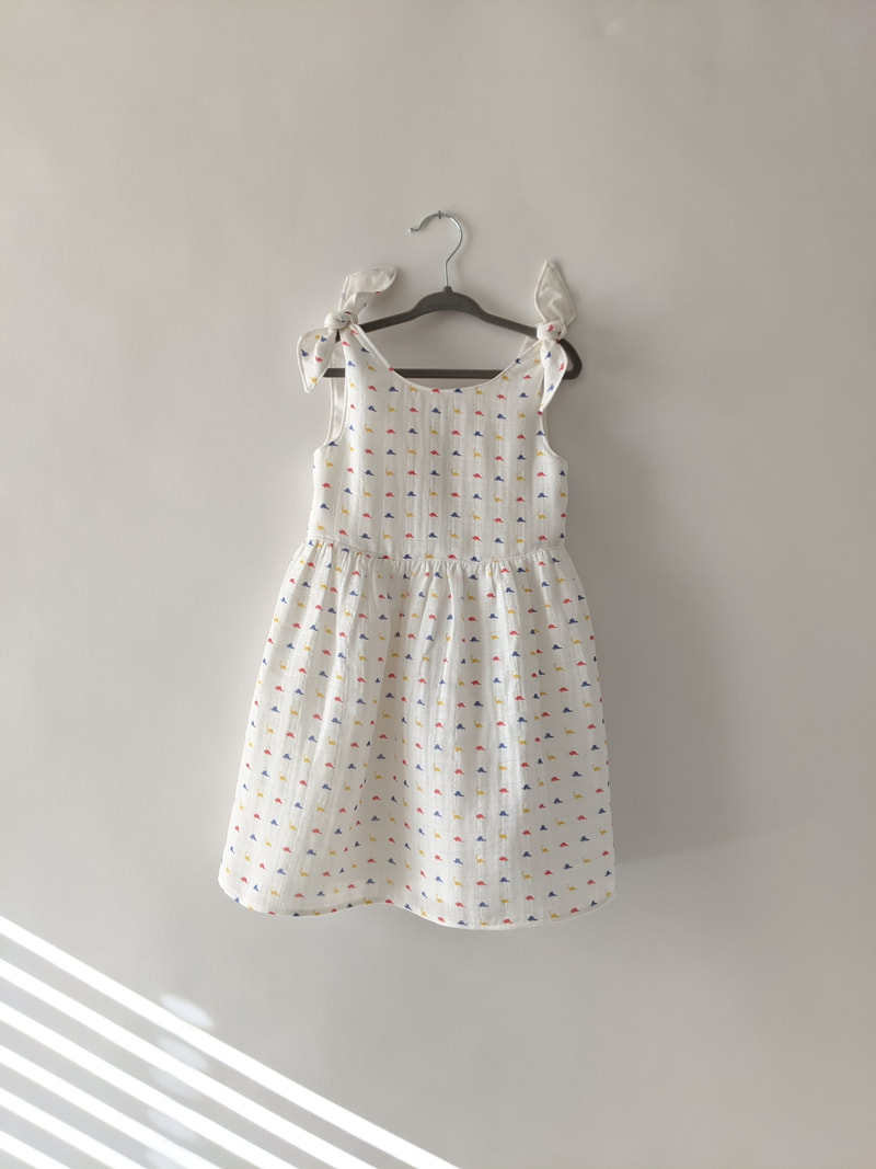
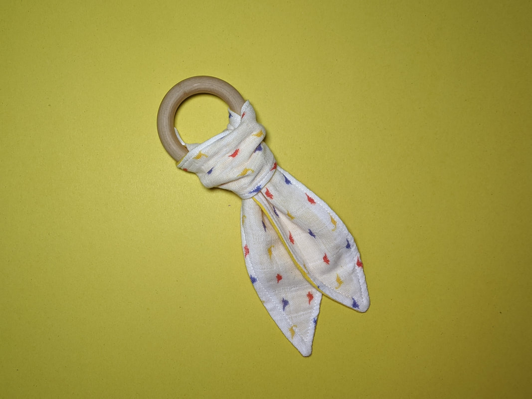
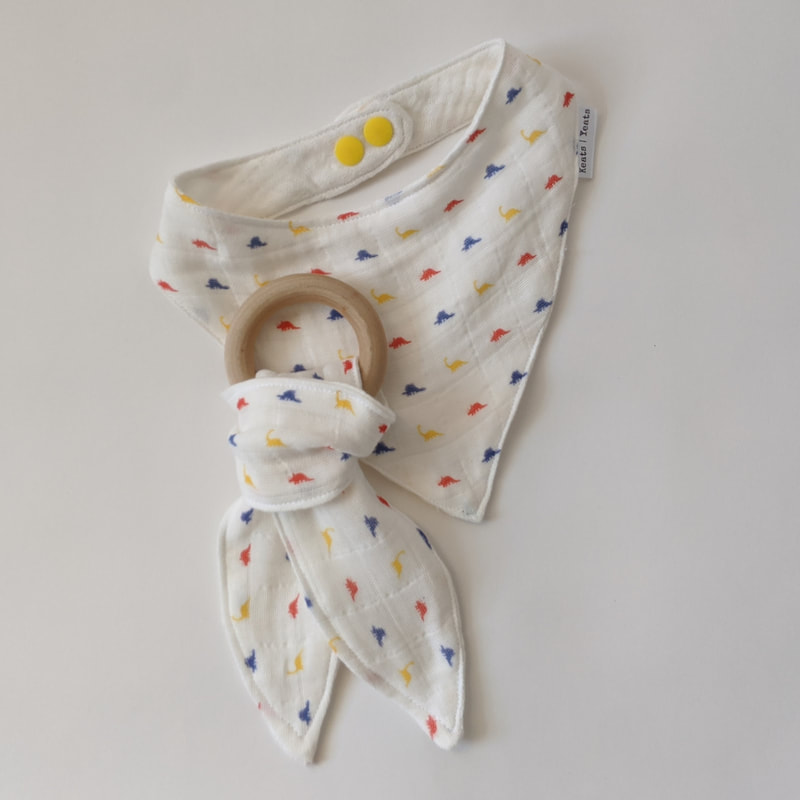
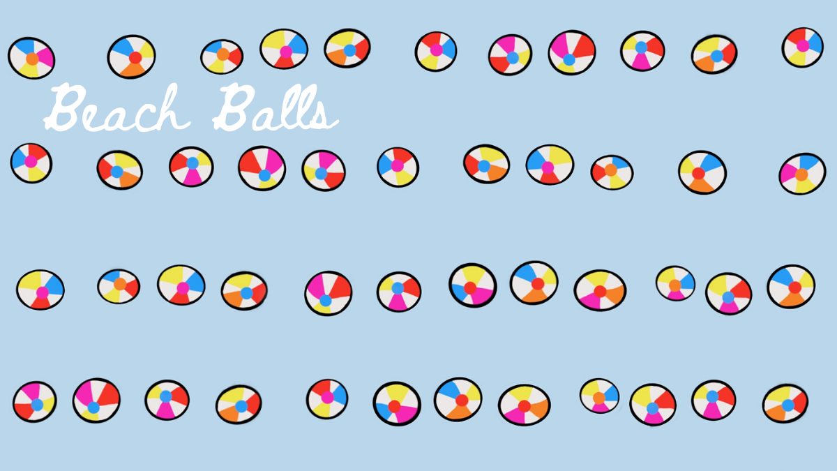 What a clever name! I was on a bender with water, floatation devices, and bird’s eye views. I also was really into mimicking stripes…and I may revisit this design to randomize the balls instead. I think I prefer a mess of beach balls rather than lines of them. Perhaps I’m just craving being on vacation and being away from the order of my home office. 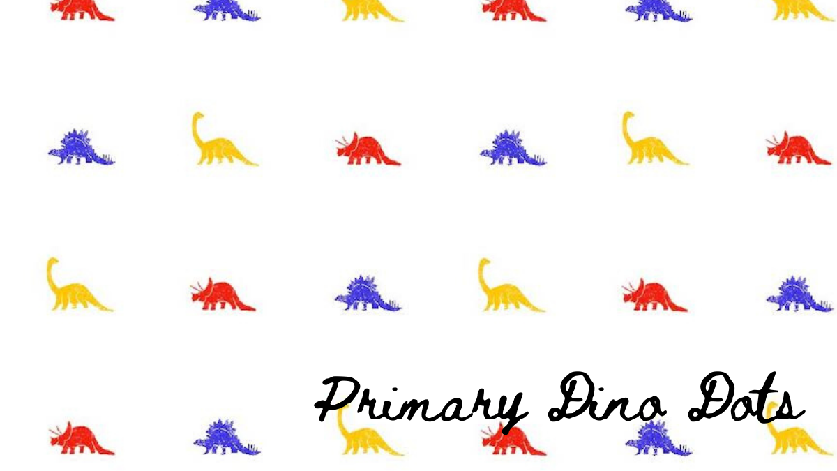 This one is a cutie - inspired by the dinosaur decor of my brothers' 80s era bedroom. I wanted it to look crayon-ey, if you know what I mean. And simple. I was also trying to mimic the look of polka dots. So, from afar someone might think "colorful dots". But when they get closer (But not too close. Thanks covid.) and they'll be like "No, my mistake. Those are in fact tiny extinct herbivores." I haven't tested it, but I'm pretty sure you can tell these are dinosaurs from 6'. So, we are good. Some of these items can be found in the Keats Yeats Etsy shop.
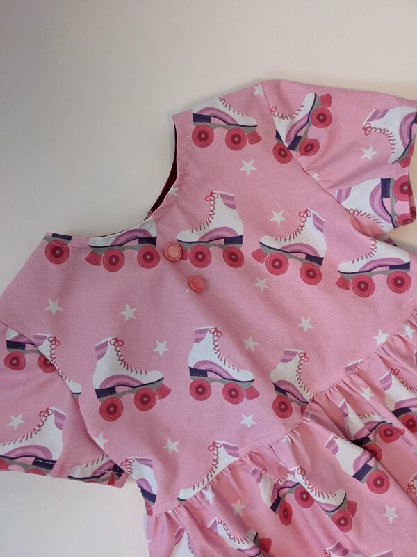
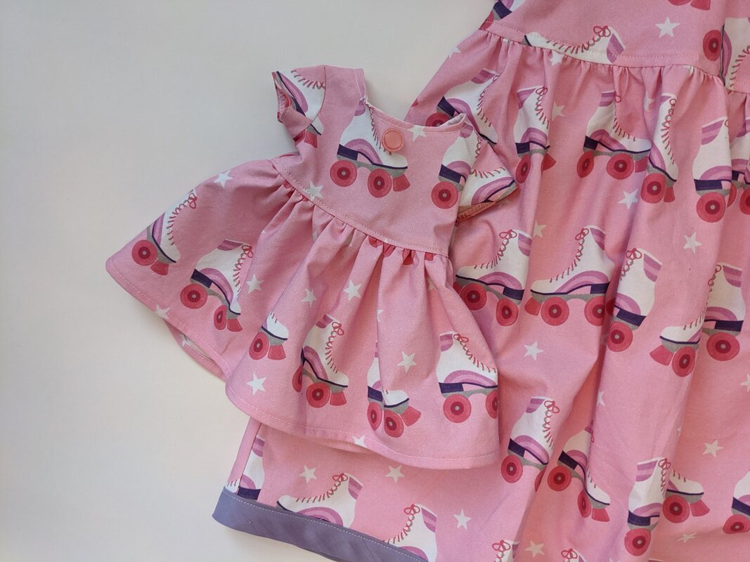
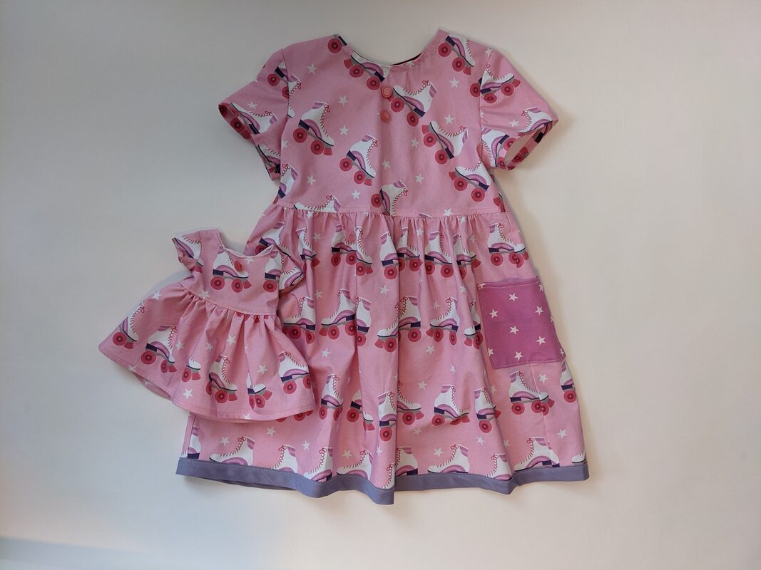
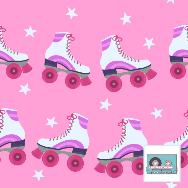
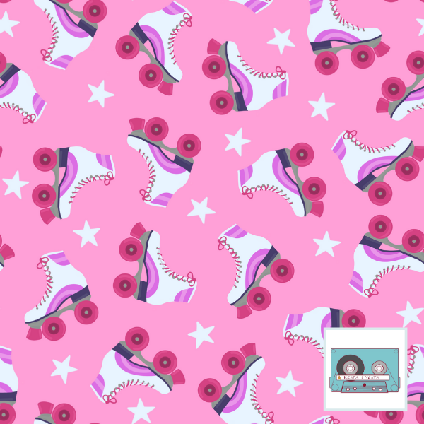
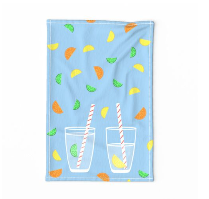
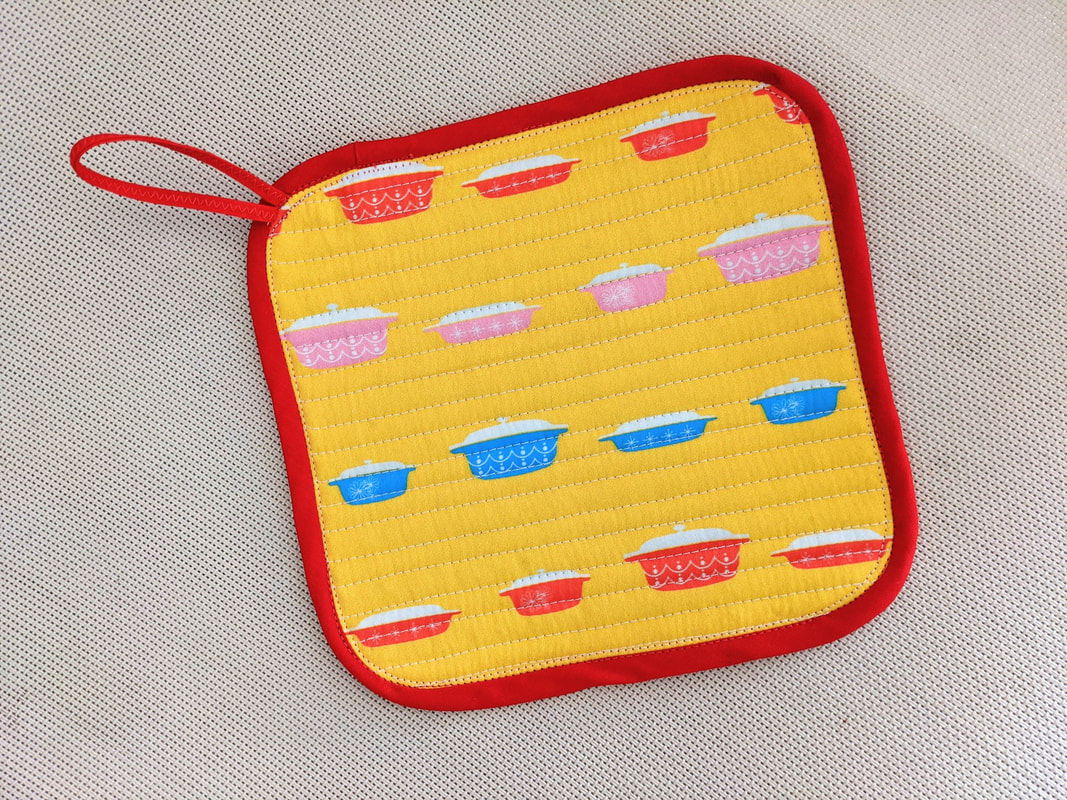
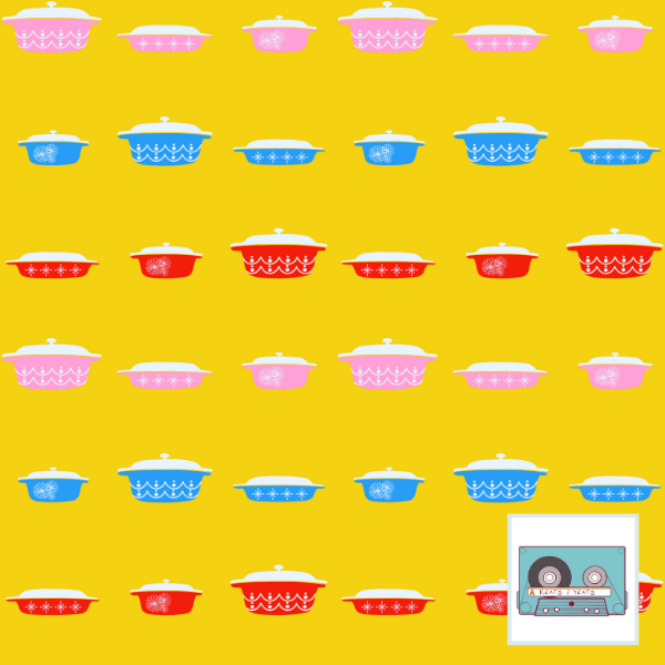
This fabric is available for purchase by the yard at Spoonflower. 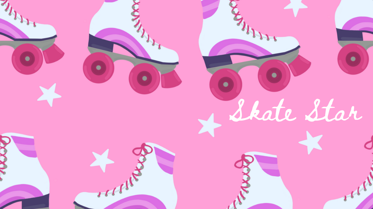 Revising roller skates. I took the basics from part of an older design and reworked it a little and completely pinked up the colors. The roller rink in my town is very old and has a wood floor. Supposedly it floats! Like the building was made to float. Why? Because it's next to a river that has flooded in the past. Now that I'm writing this, it sounds very silly. I may need to check my facts. Wait! New plan! Start making actual money from this and then hire a fact checker to do that for me. Stay tuned. Like for a while. Anyway, in that roller rink, there are little practice areas off of the main floor. One of them is wavy, so you can skate over little rolling hills. That's what came to mind when I created the flow of the roller skates for this design. Skate Star placed 257/417 in a Spoonflower Design Challenge. I think I formatted it a little too big, so voters couldn't see the whole thing. That, and maybe pink and white roller skates are over done. Who knows. I thought the whole thing was so cute that I made a whole mini-collection around it. 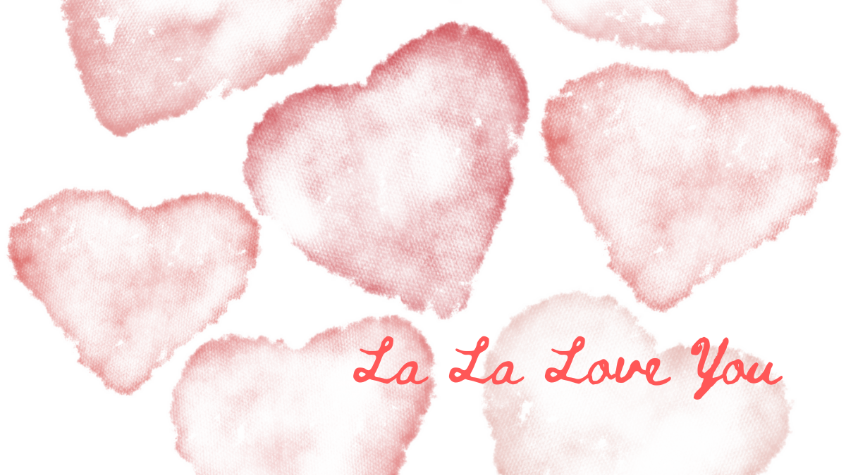 Little watercolor hearts. Is there anything sweeter? Probably not. I have plans for doing a whole collection. Maybe with some xo's tossed in. Who knows what else. But all watercolor-ey softness and texture. 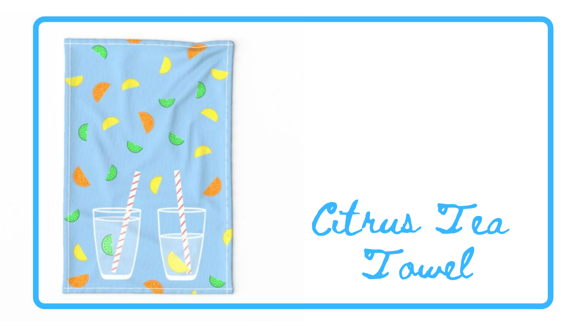 For fun, I did a doodle-a-day challenge to kick off 2020. For one of the designs (I don't even remember what the prompt was - water? drink? who knows) I did a little glass with a stripe straw on a bright blue background. A commenter mentioned that it would make a great tea towel. So, I picked up the citrus elements from an older design added them in and created a template. I really just love the summery colors. And would have to agree: It is an adorable tea towel.  Designed for a Kitsch-themed Spoonflower Design Challenge, I went with the iconic look of vintage casserole dishes. I wanted fun color pops...and always love a bright yellow. I pictured this fabric as curtains in a 50s themed kitchen. OK. That might be overkill, but surely this would make for adorable cloth napkins, tea towels...for sure an apron. I ranked 265/513. So basically right down the middle. Not too shabby, I guess.   Another entry for a Spoonflower Design Challenge - this one way outside my wheelhouse. Black and White Painterly. My medium at this point is all digital, and I was still getting to know brushes. Actually it was a good exercise in that regard. I wanted it to show more layers and texture than I was able to capture. This just isn't a design I would ever use, so we'll call it practice and put it to bed. I placed 364 out of 584.
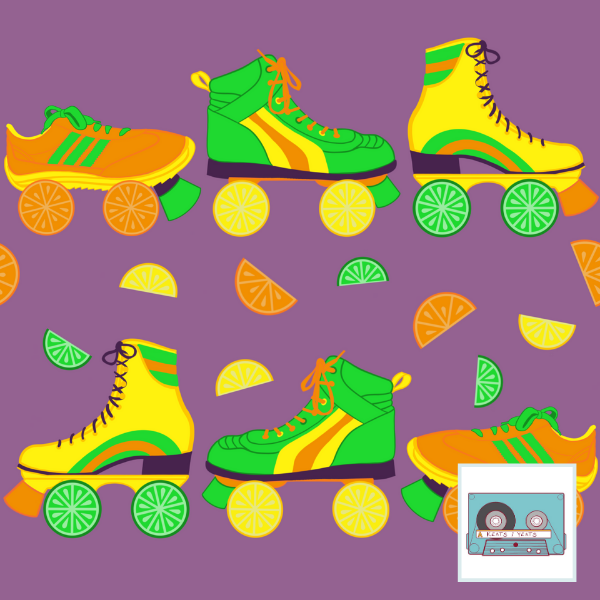
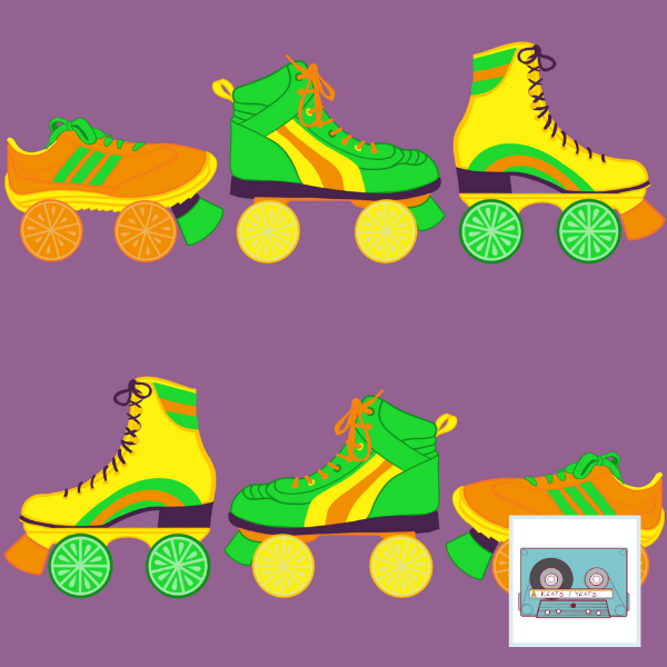
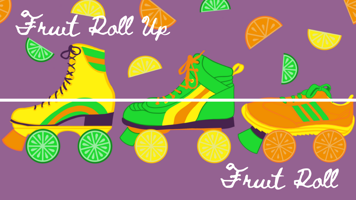 The design challenge theme was Pop Art Citrus. My inspiration was disco/roller skates and using a surprising color palette that sort of slanted toward the 70s. I like the idea of the skate wheels being slices of fruit, and the yellow, green, and orange went right with the citrus. I added purple to just go all in. Personally, I thought the colors were fun and refreshing. For some reason I stay away from orange and purple when I'm drawing. And though green is my favorite color, I don't end up using it much. So this design purposefully filled in some gaps. I couldn't decide whether to add the halved bits of fruit or no. The design I entered the fruitier design. But it didn't fare too well among voters - I placed 417/582. Just guessing that the colors were a little too weird and the skate/citrus mashup not quite marketable enough to be a favorite. All in all, I think they're fun prints. Shrug. |
Archives
August 2021
Categories
All
|


 RSS Feed