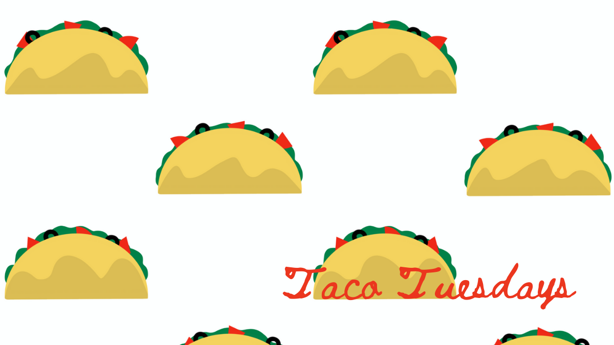
 After college, but before I really became an Adult I lived in Los Angeles. For a while there, a group of us would walk to a local Mexican restaurant and enjoy $2 taco night. Which was on Wednesdays. Makes no sense. Everyone knows Taco Tuesday is where it's at. I drew these pretty minimalist crunchy tacos when I took a short solo trip for my birthday. The condo I rented had a kitchen, so I made food just for me and just how I like it all week. I may have eaten very bland tacos every night for dinner. (I like fancy tacos too, but bland tacos are the tacos of my youth.)
This print is available at Spoonflower if you too like very simple tacos.  I was going for something different with that dark background. I was trying to incorporate orange and then the other colors just worked themselves out. I think it's cute, but still needs some work. The empty space feels super empty, but filling it makes it too busy. I just don't know what to do. I like where it's going, But, well, more work needed!
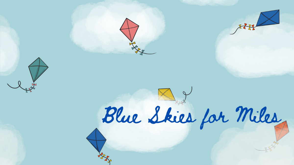 I've been working on these fluffy clouds for a while. I like them. I've also been wanting do do kites. So {boom] I put them together. I mostly approve of this design - but want to revisit it and make the clouds a little smaller and/or more sparse. It won't be available for sale until then! I'd really like to do a whole cloudy sky thing with different things you find up there in the great blue beyond. Old timey planes? I've already done a balloons...*hot air* balloons maybe? Pelicans? I don't know. I'm just spitballing here. More on this one to come!
This design was for a Spoonflower Challenge - Views from My Window. 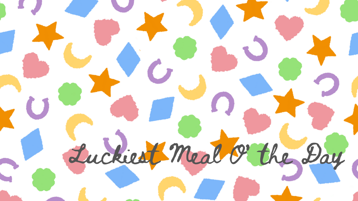 The theme was Talismans, so naturally I went with kid's breakfast cereal. Duh. I opted for the classic Lucky Charms marshmallows and wanted them to look kinda like they were floating in milk. That's all there is to it. I do need to do a little more work on the placement of the little icons around one edge, and then this one will be available. I picture it being a really cute mens button down short-sleeved shirt in a super crisp cotton.
  My entry for a Spoonflower Design Challenge! I'm trying to enter at least one a month this year. The theme was Small Scale Geometric so naturally I went with ice cream. I like that the simple circles and triangles give the appearance of scoops and cones. And that Neapolitan is iconic enough to be implied by the color palette. I quite like this one, but placed 611 (ouch) out of 1148. Onward!
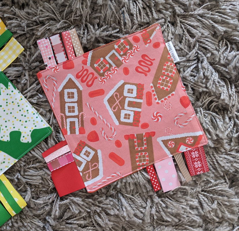
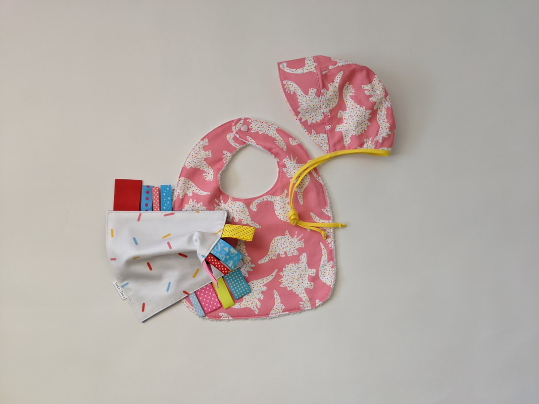
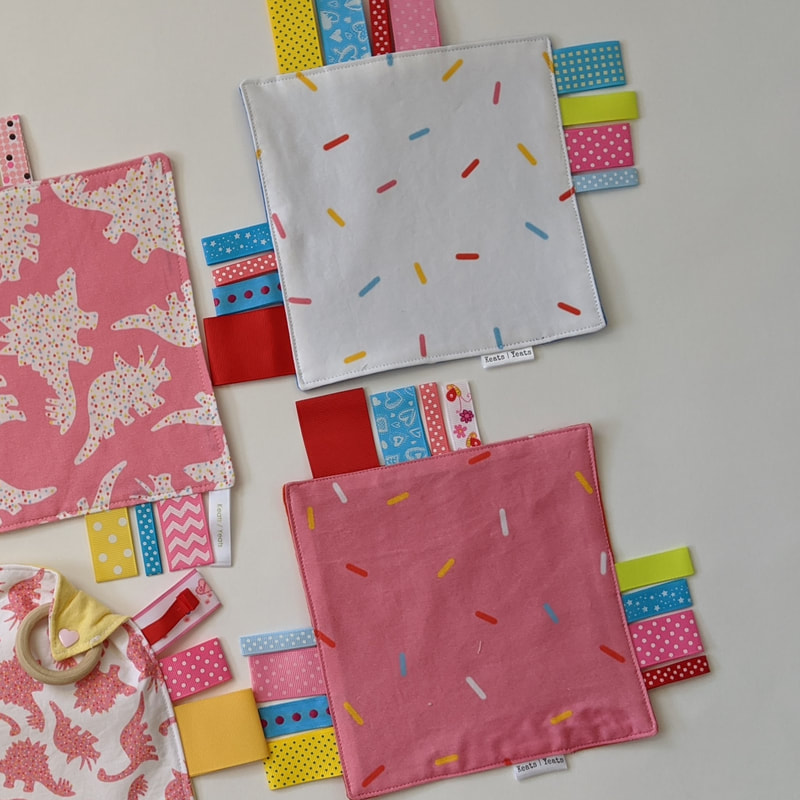
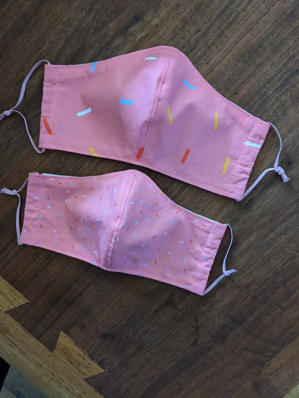
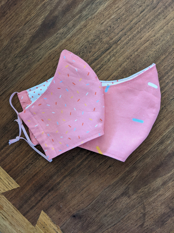
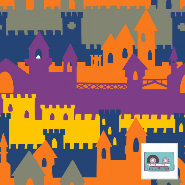
This one is now available at Spoonflower. 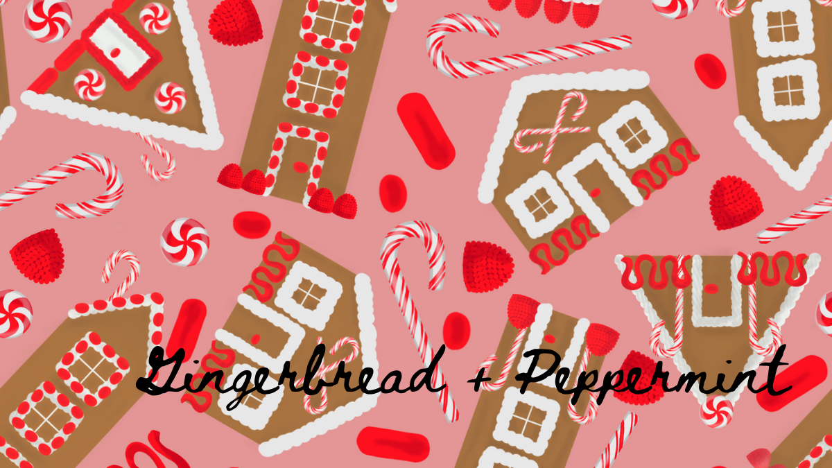 This is a little something I worked on last December. I don't think 1) I ever got the color combos quite right. I did want pink, red, brown, and white. I made one adjustment, but then abandoned it. And 2) There is a weird mix between parts of the design being simplistically and trying to do more complex shading. It needs more work. It's hard to get excited about holiday designs outside of the holidays though, isn't it? I don't know how people plan so far ahead when it comes to holiday prints. I did enter it in Spoonflower Design Challenge and was pretty close to the bottom: 307/391. OUCH! 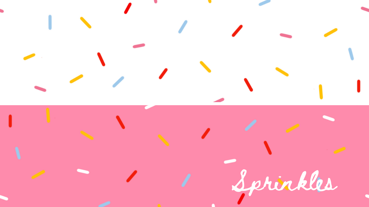 I worked on these sprinkle patterns a while back, but hadn't really done anything with them. But, the are festive and sprinkles go well on just about everything. I thought I'd be doing an ice cream series, and started here. As of yet, I haven't done anything else. It's 2020. What do you want from me!? Update. A friend got in touch about her mother/daughter Halloween costume. They decided to be a Baker and Donut. Seeing as how we are living in a pandemic, they requested masks to wear with their costumes. And I knew just what to do... 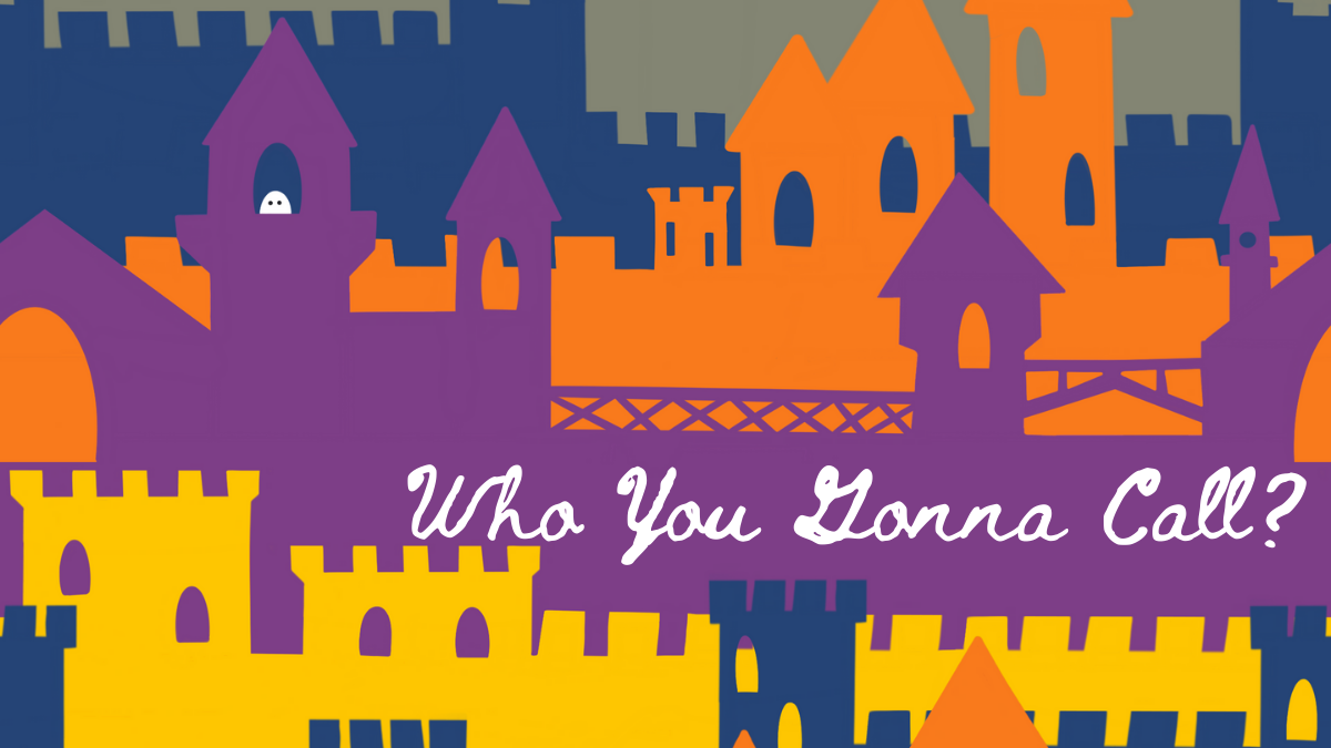 The theme for the Spoonflower Design Challenge was Gothic Halloween. So naturally I went with castles and one little lonely ghost. I'd like to revisit this one with different colors and on a different scale, so there is more castle and fewer repeated ghosts. Someday I'll master Adobe and will be able to do that easily. Maybe in time for next Halloween? Sidenote, I wanted to call this one "Bustin' Makes Me Feel Good" since that's my favorite line from the Ghostusters song, but opted instead for something more recognizable. Placed 434th out of 666 (spooky!), thanks for asking. This fabric and more available at Spoonfower.
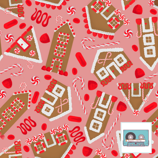
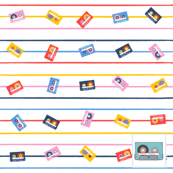
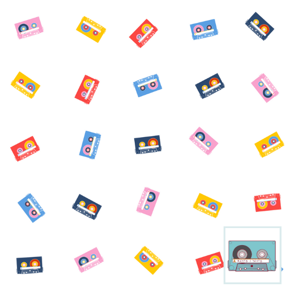
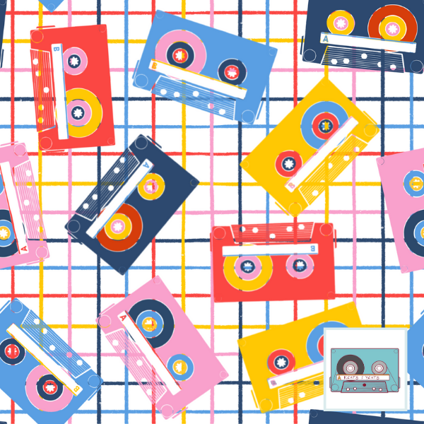
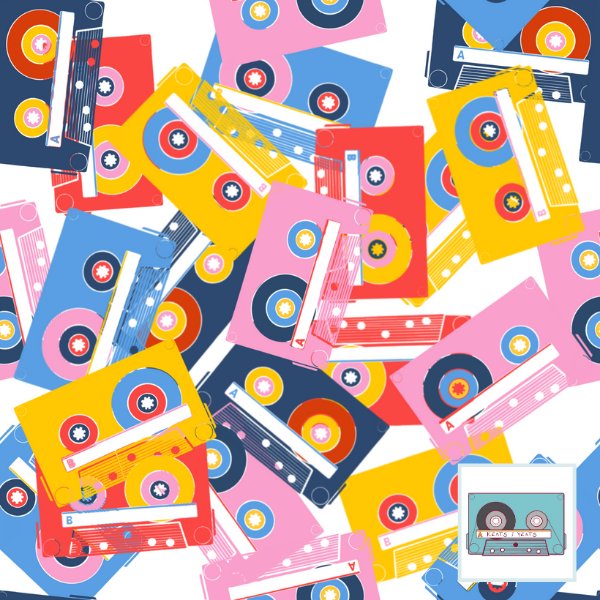
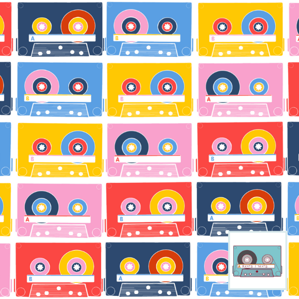
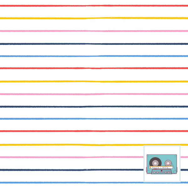
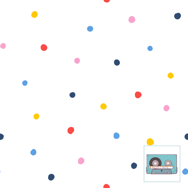
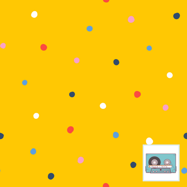
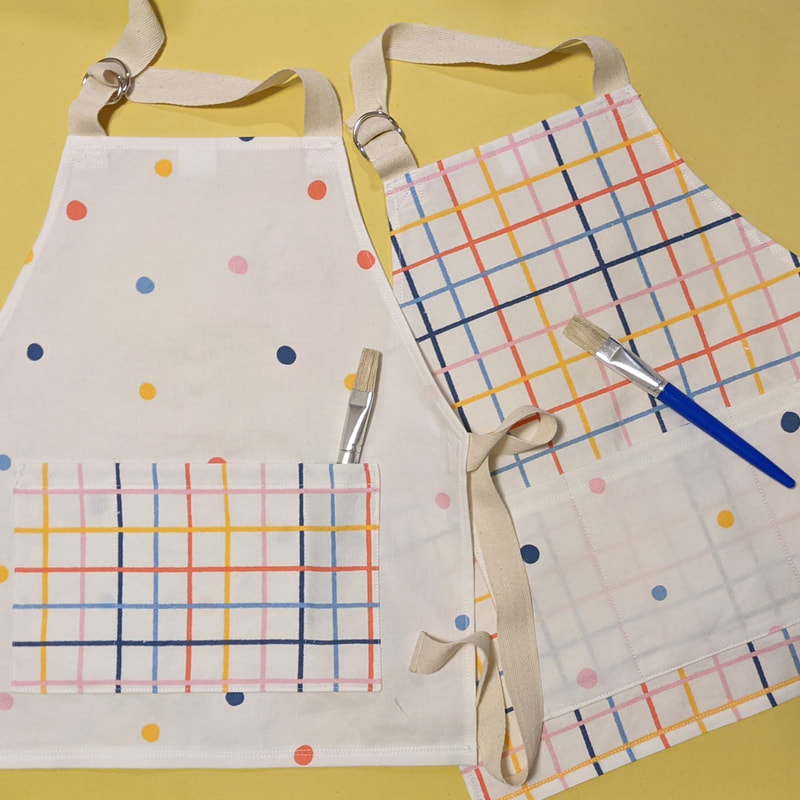
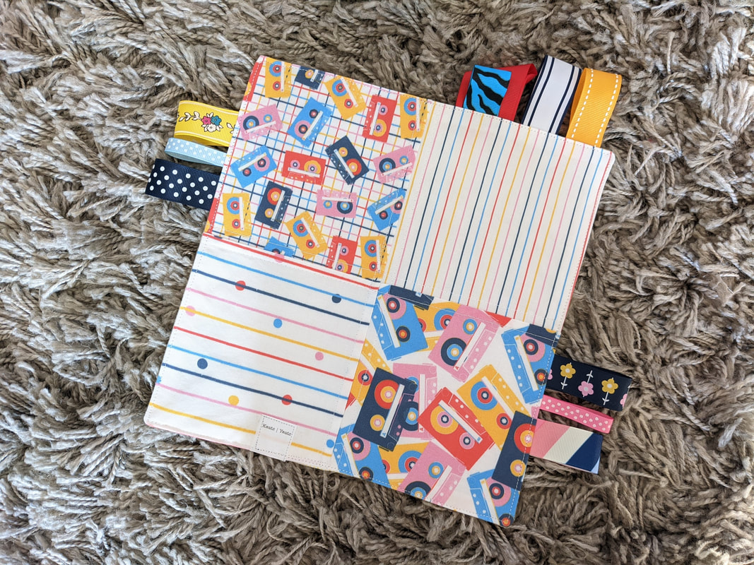
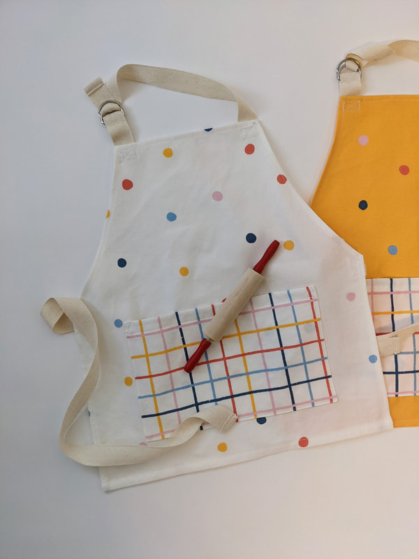
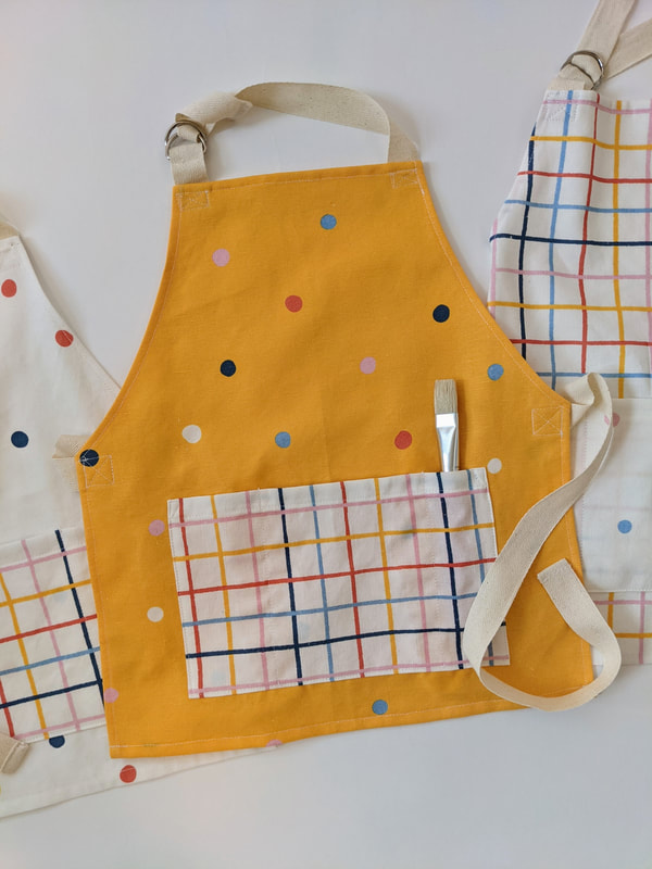
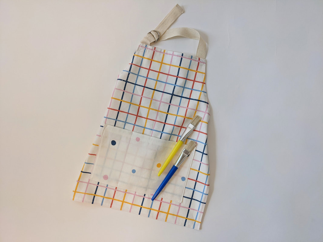
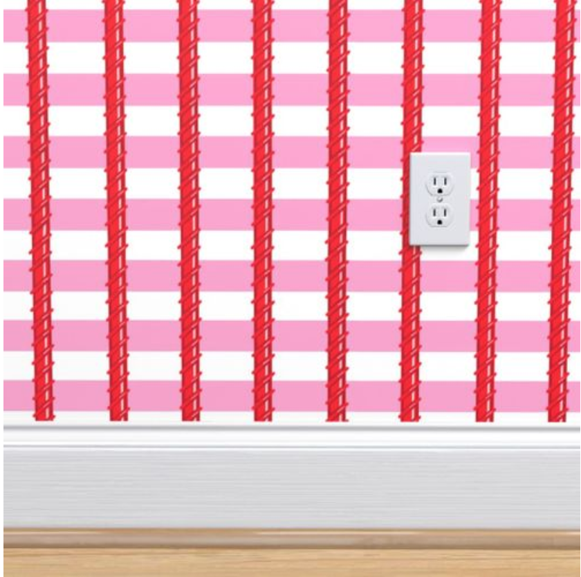
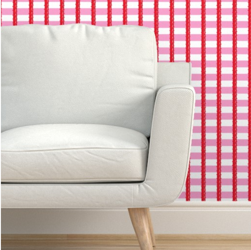
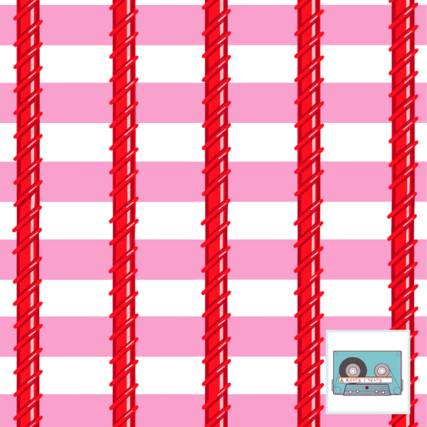
Variations on a theme may be a better way to describe these prints rather than a collection. I'm still working on how to put a whole cohesive collection together without just making the same thing over and over. More elements! There are a lot of cassette tapes here. Maybe more research, doodling, and noodling is needed. I do love mix tapes though. I also really enjoy these colors together. The dots, stripes, and grids are lovely and work great as stand-alones. So whatever. This *collection* is a lot of fun. I've already changed my mind. This one was not for a challenge or anything special. Just for me. 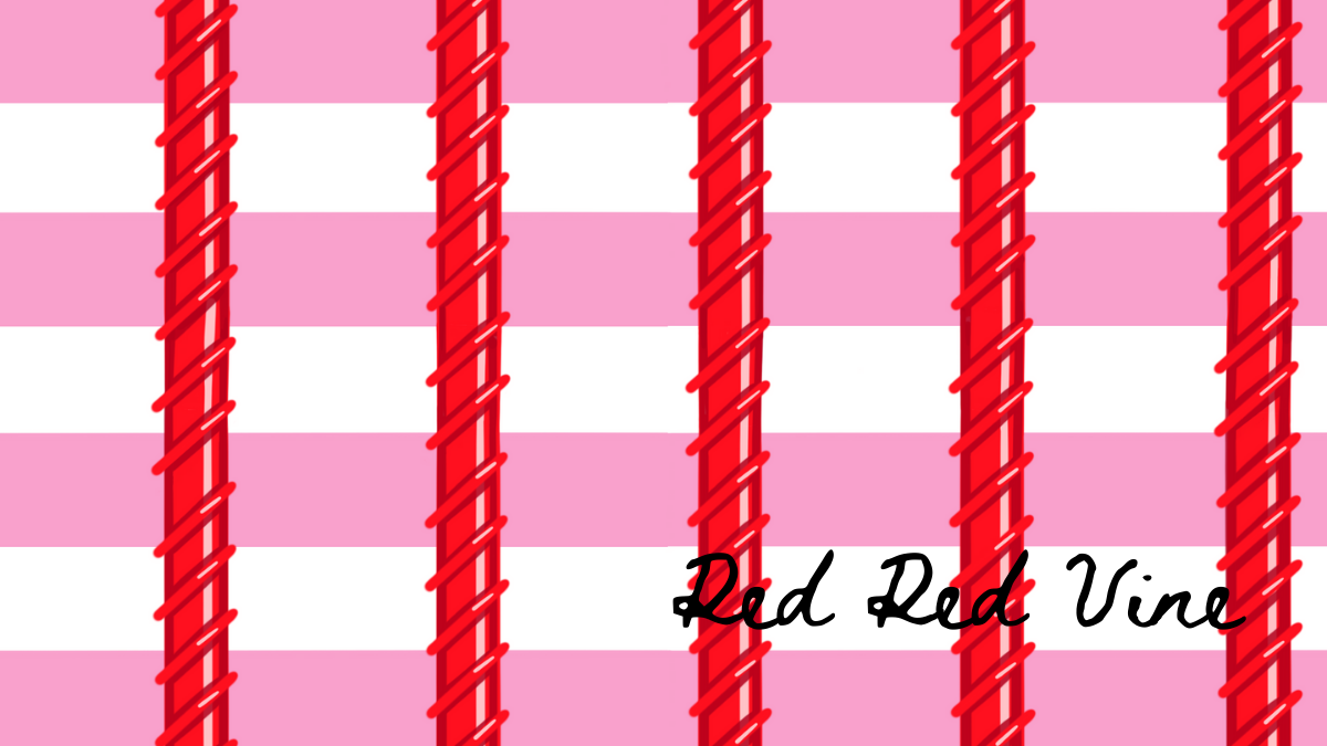 I just haven't had much time for drawing and designing lately, so giving myself the challenge in August to enter four Spoonflower Design Challenges was a little kick I needed. Buuuuuut...I may have thinked out side of the box a bit too much. The theme was climbing vines wallpaper. And I went with red vines. I mean, it would be super cute in a candy shop, right? Plus it gave me a chance to give a little nod Neil Diamond with that title. I consider it a win. Even if I only ranked 470 out of 709. Not enough sweet tooths out there, I guess. This pattern may be purchased as candy shop wallpaper, fabric, and more at Spoonflower. I have a few other sizes/colors coming soon too.
|
Archives
August 2021
Categories
All
|


 RSS Feed