|
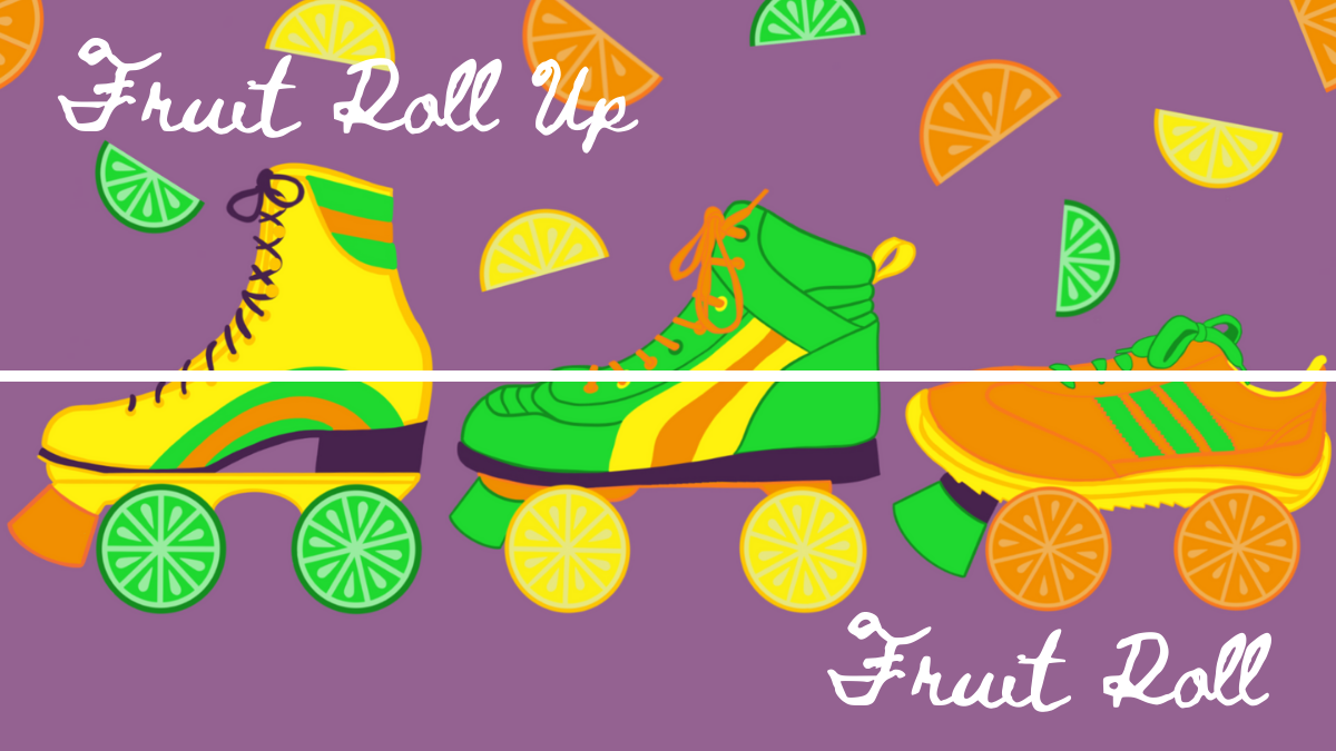
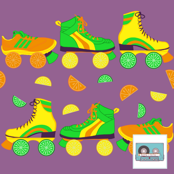
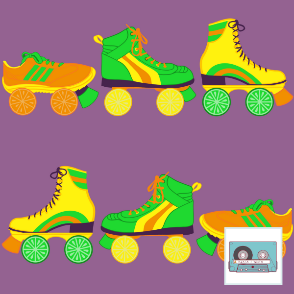
The design challenge theme was Pop Art Citrus. My inspiration was disco/roller skates and using a surprising color palette that sort of slanted toward the 70s. I like the idea of the skate wheels being slices of fruit, and the yellow, green, and orange went right with the citrus. I added purple to just go all in. Personally, I thought the colors were fun and refreshing. For some reason I stay away from orange and purple when I'm drawing. And though green is my favorite color, I don't end up using it much. So this design purposefully filled in some gaps.
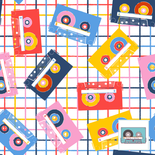
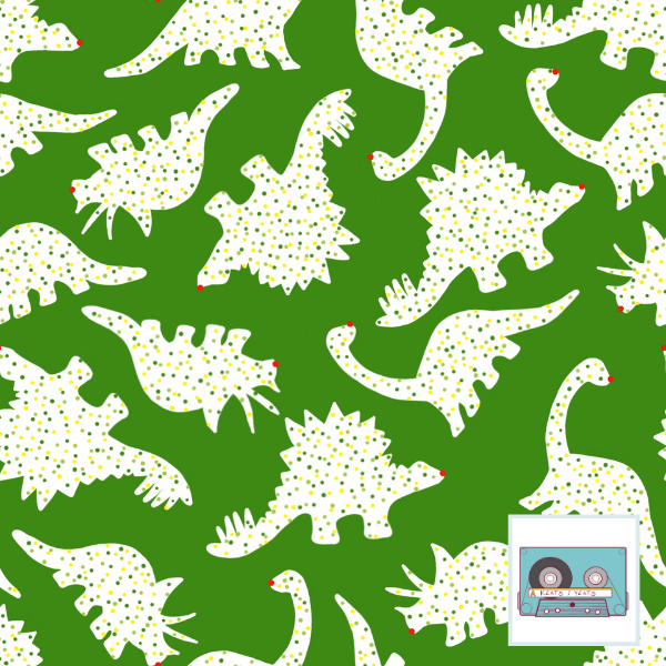
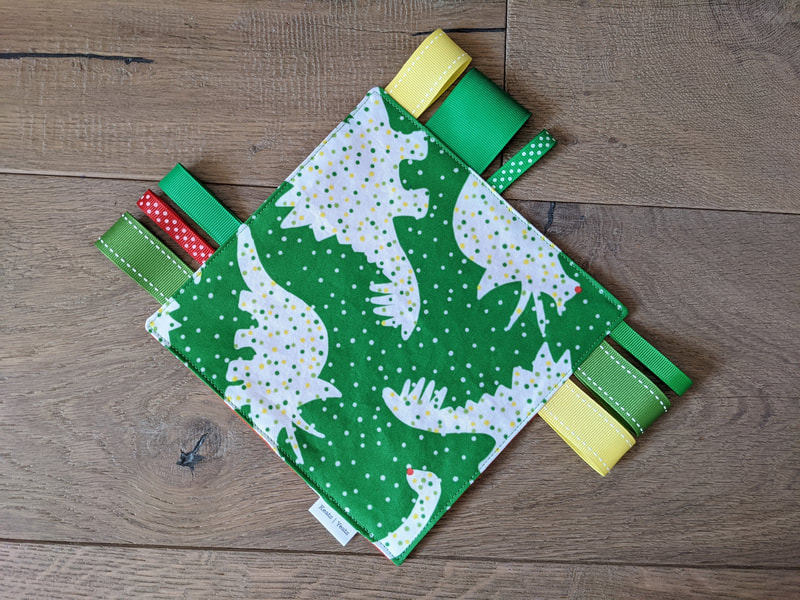
I couldn't decide whether to add the halved bits of fruit or no. The design I entered the fruitier design. But it didn't fare too well among voters - I placed 417/582. Just guessing that the colors were a little too weird and the skate/citrus mashup not quite marketable enough to be a favorite. All in all, I think they're fun prints. Shrug. A fun goof on one of my favorite collections - Frosted Dino Circus. This one made just for the Christmas holidays. A bright green traded out for pink and blue. I stuck with yellows and greens for the sprinkles so as not to detract from the little red Rudolph noses. I thought this design would get a little more traction than it has...but it's really about exposure, which is something I need to work on. Perhaps a small collection of clothing for the holidays next year would help. We'll see!
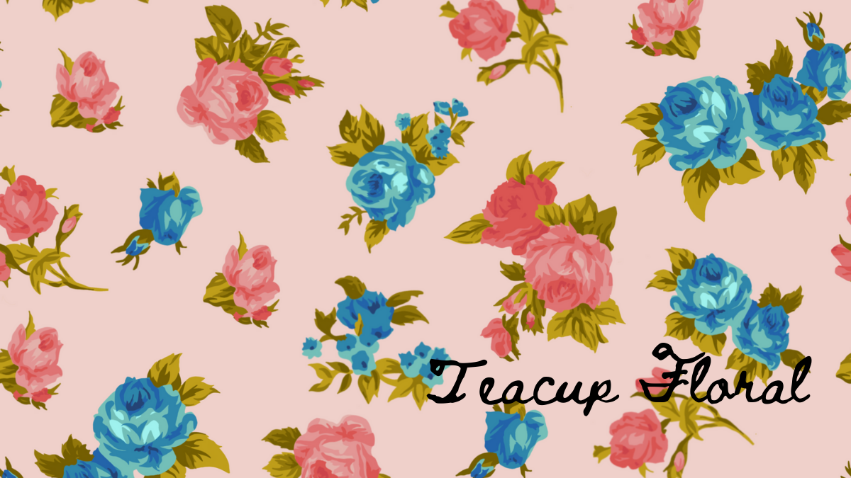
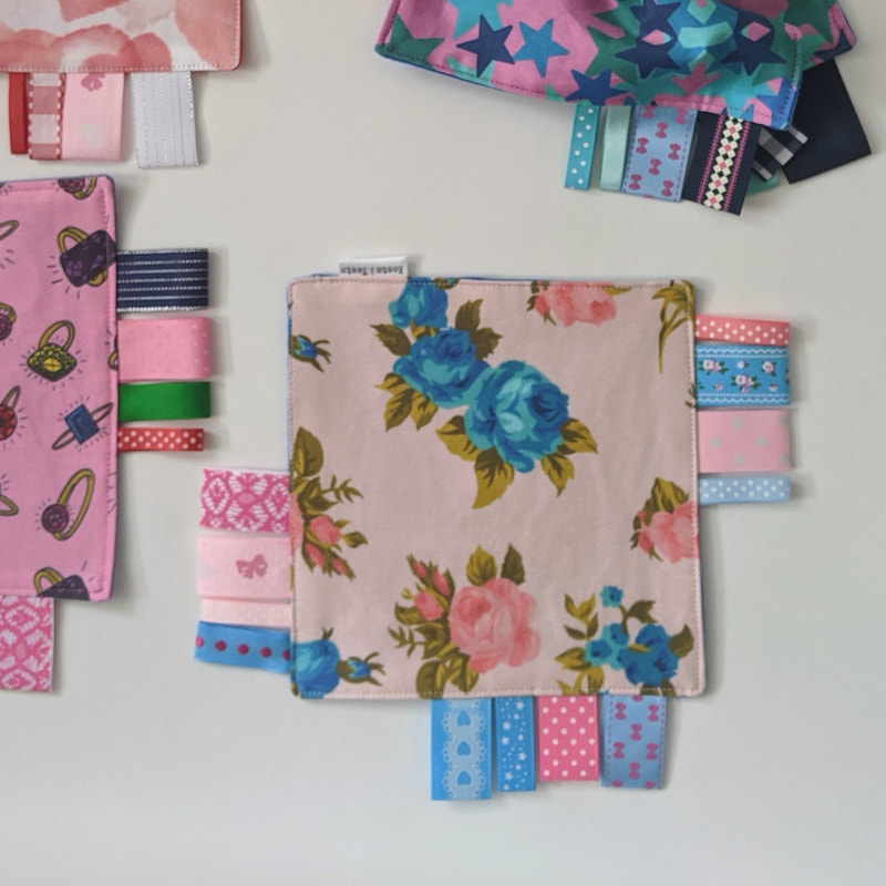
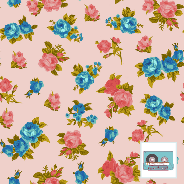
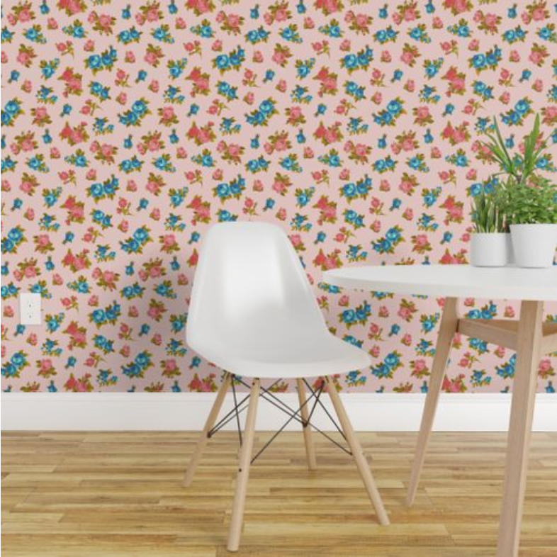
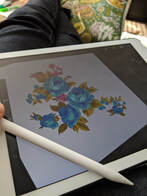 I sorta thought I nailed Chintz for this Spoonflower Design Challenge. Alas, the people have spoken and they said 302nd place (out of 500). This was, however, excellent practice for working in layers in Procreate. I did layer-by-layer "painting" dark to light for each rose and leaf. I thought it worked quite nicely. It has a paint by numbers vibe, yet feels very grandma. Which is totally what i was going for. |
Archives
August 2021
Categories
All
|

 RSS Feed