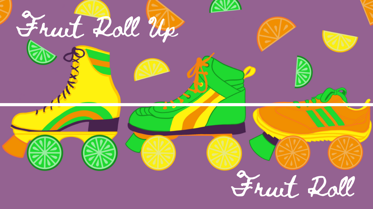
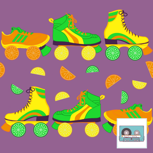
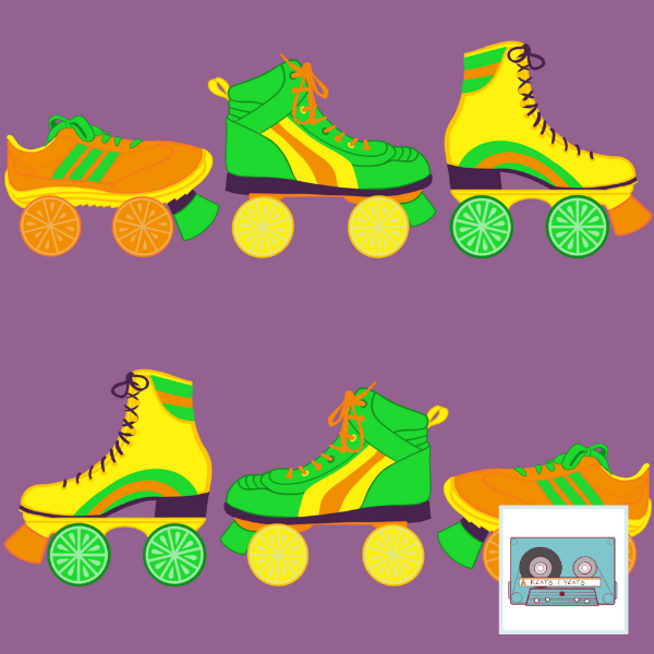
 The design challenge theme was Pop Art Citrus. My inspiration was disco/roller skates and using a surprising color palette that sort of slanted toward the 70s. I like the idea of the skate wheels being slices of fruit, and the yellow, green, and orange went right with the citrus. I added purple to just go all in. Personally, I thought the colors were fun and refreshing. For some reason I stay away from orange and purple when I'm drawing. And though green is my favorite color, I don't end up using it much. So this design purposefully filled in some gaps. I couldn't decide whether to add the halved bits of fruit or no. The design I entered the fruitier design. But it didn't fare too well among voters - I placed 417/582. Just guessing that the colors were a little too weird and the skate/citrus mashup not quite marketable enough to be a favorite. All in all, I think they're fun prints. Shrug. Comments are closed.
|
Archives
August 2021
Categories
All
|
 RSS Feed